Dynamic Type
SwiftUI uses Dynamic Type to scale fonts based on the user's preferred text size (the size can be changed in the Settings app). At the moment of writing, Dynamic Type is not yet supported on macOS. When writing SwiftUI code, we can use the .font modifier to automatically set a dynamic type style, such as body, largeTitle or any of the other builtin styles. The system then chooses the appropriate font based on the user's settings.
Scaled Metric
By using the builtin type styles, our app automatically adjusts the font sizes. However, we often have other values that need to scale with the font size. In the example below, we have an alert badge, and we'd like the padding inside the badge to automatically grow relative to the dynamic font size. By using the scaled metric property wrapper, we can scale the value relative to the caption font.
struct Badge: View { @ScaledMetric(relativeTo: .caption) private var padding = 4 var body: some View { Text("99+") .font(.caption) .padding(.horizontal, padding) .background { Capsule() .fill(.red.gradient) } }}
When we use SF Symbols in SwiftUI (through the Image(systemName:) initializer) the symbol automatically scales with the font size. In other words: system images have builtin support for dynamic type.
To render custom icons, we can use a regular Image (for example, by loading an image from the asset catalog). However, regular images do not automatically scale with the font size. We can also use scaled metrics to adjust for this. Note that we use the default body font size (17 pt) as the reference point.
struct ContentView: View { @ScaledMetric(relativeTo: .body) private var imageSize = 17 var body: some View { HStack { Image("cart") .resizable() .aspectRatio(contentMode: .fit) .frame(height: imageSize) Text("Add To Cart") } .foregroundStyle(.white) .padding() .background { RoundedRectangle(cornerRadius: 8) .fill(.purple.gradient) } }}
When we design with scaled metrics, it is important to first set the dynamic type size to the default value (Large) and make sure our view looks as expected. Then we can move constants into scaled metric properties and have them adjust automatically.
Builtin Sizes
The Human Interface Guidelines provides a table with all the different sizes. The following list displays those same sizes using a preview:
Dynamic Type is not implemented as a multiplier that simply scales the font size. Instead, each style has a set of predefined values for all dynamic type sizes. In the graph below we can see how they do not scale up linearly as the dynamic type size increases.
Resources

The Human Interface Guidelines contains an article about dynamic type with examples and platform considerations.
https://developer.apple.com/design/human-interface-guidelines/ios/visual-design/typography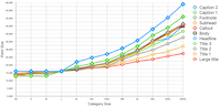
Keith not only shows how to use the scaled metric property wrapper, but also how to do the same thing in UIKit.
https://useyourloaf.com/blog/the-@scaledmetric-property-wrapper/